Creative Block is a weekly newsletter that gives you a glimpse into my life, creativity, design, and music. It's like a little pick-me-up that you get delivered straight to your inbox each week.
In one of my previous newsletters I told you guys I’d do a better job celebrating my wins.
So today I want to share a project I worked on with La Mer and what I learned in the process.
For context, this project took 2 years in the making and it’s for La Mer’s BLUE HEART INITIATIVE.
With our Blue Heart initiative, we aim to give back to the ocean which has provided us with so much. Through awareness-raising programs, partnerships with inspiring environmental advocates, and charitable donations through the La Mer Blue Heart Oceans Fund, we’re committed to helping protect marine habitats across the globe in hopes of ensuring flourishing seas for generations to come.
To be honest when they reached out, I was excited but also nervous because I looked at the past few artists they worked with and they were amazing Illustrators. I started asking myself “why did they pick me?” but now looking back I see why.
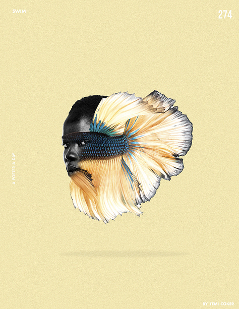
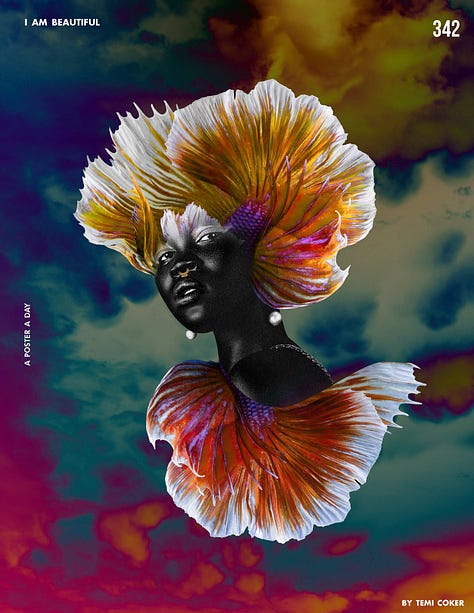
The cool thing about this project was that they were referencing some of my work from 2016-2018 during my “A POSTER A DAY” series. These were some of the posters I made back then that made them reach out. As you can see, I was heavily inspired by fish fins and putting them on humans. What a weird phase this was, but I loved the end results of this exploration. Who knew 5-7 years later it’d bring me this amazing opportunity!


If you see the work I do now you can tell that I’ve developed a different type of style utilizing more shapes, color and composition.
Here are some of the designs that didn’t make the cut for La Mer. My Favorites are #1, #2, #6, #7 and #9 in that particular order (counting from left to right).


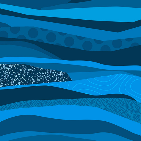
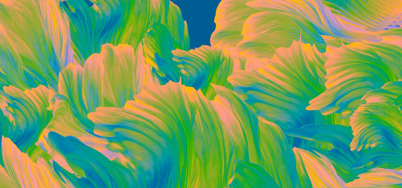
The Idea was to draw inspiration from the ocean and its inhabitants. I was going for a wavy look and feel to mimic the ocean while adding in La Mer’s blue colors in the design. I even went as far as including fish fins/coral colors there (which they ended up loving).
My process was chaotic because of the deadline so I was exploring any and every tool in photoshop / illustrator.
Once I sent them the designs they picked this one as their favorite and wanted me to change the colors a bit and expand the canvas.
They then sent me a template illustrator file to put the designs in to see how it would look on the packaging and bottle.
here’s the final product. I also teamed up with my videographer to break down the project a bit and share what I learned. Enjoy! Purchase here it you want! It’s sold out in all the other stores!


wait this was really awesome to see wow!!! I would love to share some content like this too, you've quickly become a super inspiration for me. omg I want to be a creative like you, can you talk more about the "discipline" that goes behind the "poster a day" challenge for example? I find it so hard to stick to doing one thing every single day? Like designing a poster for example, how do you find the freedom and also the boundaries to do something every day and call it done, do you set a timer? sorry for all the rant of questions jaja
I loved seeing the process, I'd enjoy seeing more projects like this you've done :)